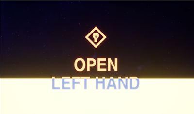
UE4 Overlapping Text material

Within a 360 environment, it's difficult to get everything looking aesthetically balanced and often when using player guidance such as text it can get lost. This quick blog is to show you how to make the blueprint to avoid this. The text needs to be yellow, but so does the floor. When looking around it's not a problem but if a player is looking down the texts will mostly be unreadable. This is unacceptable so you can simply create an alternate colour for the overlap. Make sure Surface and Translucent are selected. And that you've disabled depth test. Or this will happen. The blueprint below shows how to set it up. The outline colour (red) lerps between the two base colour pre-sets (orange and white). The lerp alpha is masked with R and G channels and then clamped. Hope this helps and thank you again to Zoe Yu!