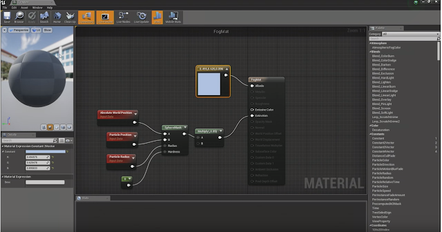
Unreal 4 Lighting Academy with 51Daedalus - Part 1

A friend recently recommended this series as an excellent example of how to do lighting properly in the Unreal engine, and I couldn't agree more.
51Daedalus breaks down the scene and gives great feedback with tips and tricks how to make the lighting even better. If you have a few hours to educate yourself, check out the full series using the link below.
https://www.youtube.com/playlist?list=PLqfZolvobgUDAm-c41cDR8NDA79UKuN4b
There is a lot of information to process, and I've done my best to capture most of it, this blog isn't about copying the information but rather one of my own notes and make sure that I full understand it.
Before starting really explore the scene description, what does the level needs to achieve, review all the reference material and develop the mood and feeling it will evoke.
The technology is pretty straight forward, it gives the Artist the tools to be totally expressive without restrictions, however the Artist needs to have the knowledge and training for digital lighting to be effective. Study all types of lighting from paintings, film, animation and video games.
Review the texture quality of all the assets in the player area and scene, because this project is based on creating a 2D image output, use lots of dynamic lighting and high textures without the worry of frame rate and system resources. Aim to get the best possible image.
Post processing - Remember that Auto exposure doesn't effect dynamic lights, it just intensifies the the effect of the light maps.
Ambient cubemap - Try not to use this, and turn if off. Ambient cubemaps don't produce accurate shadows and the Skylight function does a better job.
At the start of a project the lead or director will have a chosen colour palette for the scene. Make sure that the textures used fit, but if not check using the Buffer visualization, Base colour pass. You'll quickly be able to tell which colours aren't working and remember to never use full black.
Saturation and Post effect tint is a great feature. Visually balancing a scene is tough but with a few adjustments it can be achieved.
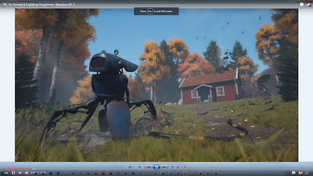
This is the scene created by the talented artist Saralie Wagstrom. It's a pretty cool scene already and that fact its being used to create static images and not a playable level means that fps and resources can be used heavily. Check out her work here: (https://www.artstation.com/artist/saraliewagstrom)
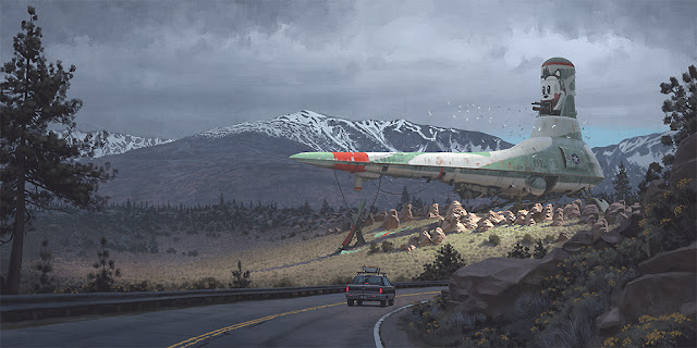
The references provided are by one of my favourite artists, Simon Stalenhag. (http://www.simonstalenhag.se/) Both his books can be found at the Book Depository for a great price and I would really recommend them.
(https://www.bookdepository.com/search?searchTerm=Simon+Stalenhag&search=Find+book)
This is a great example of his work, blending present and future elements with a flat colour palette to create this scene of recognition (Scandinavian landscape and car) and acceptance. (a huge giant spaceship)
Skyspheres
Check that the Skysphere sun and directional light Actor match the same direction. Having incorrect shadows can quickly ruin a great level.
If the skysphere settings, experiment with the options. Colours determined by skylight can have a huge effect on the scene. Of course, if the skydome images aren't giving you quite the right light, make a custom skydome of your own. Find a HDRI sky (http://hdri-skies.com/) and use this for a better light and shadow result.
Again, check the skysphere settings and adjust the 'Sky distance threshold'. You can use the 'reflections view mode' to see the changes.
This also includes distance field in the build settings, individual mesh actors can be deactivated by changing the resolution scale value to Zero. This can help visual errors and save resources.
High quality textures what to have no mipmaps selected and use a 'vector displacement map' as it uses a RAW image and we want that to look as smart as we can get it. The horizon has been cut and mirrored in the example below, the sun also removed on the lower half.
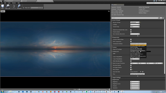
You may want to experiment with the 'lower hemisphere is solid colour' tick box, depending on what sort of scene your creating. The colour picker can be used to create a fake bounce light onto assets. You can either use the colour eyedrop, or take a the screenshot and drop it into photoshop. An average blur will give you a flat colour to be used. Copy the reference back into Unreal. Remember to screenshot using the base colour visualization for the reference.
In the Engine content, the Editor Sphere can be found. Drop this into your scene and then enlarge until is completely surrounds it, your new skysphere is almost complete.
In the Engine content, the Editor Sphere can be found. Drop this into your scene and then enlarge until is completely surrounds it, your new skysphere is almost complete.
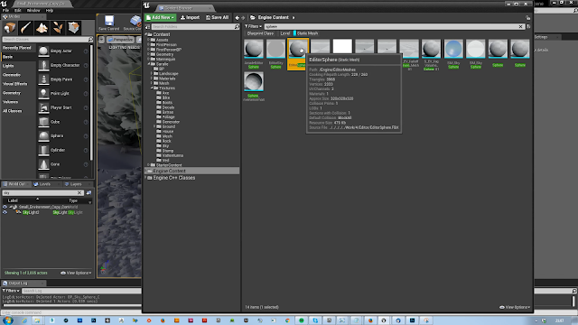
Also, the same as asset actors the Editor sphere, found in the Engine content can have the distance field resolution set to zero.
Create a new material and plug in the sky image. Use 'unlit' and connect the node to the emissive. Of course, if your scene looks black, it's because you need to active 2-Side material because we are viewing it from the inside.
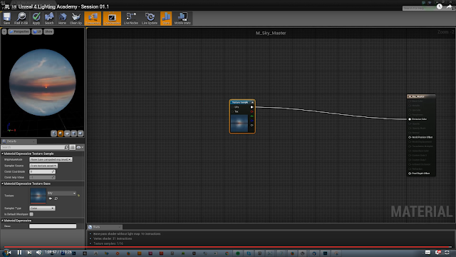
Finally, turn off the dynamic shadow. Now you have a great looking sky which is based on real physical lighting and will help the scene be more aesthetically pleasing and correct reflections.
Thank you so much 51Daedalus, I cant wait for the next installment!


